Car Facts
Feature: Porsche Could Have Had A Completely Different Logo Back In The Day
Porsche has a fairly complex logo and yet it is very recognizable. Still, there used to be fears that it wouldn’t be strong enough and so some alternative logos were suggested. Porsche has now conjured it from under a layer of dust.
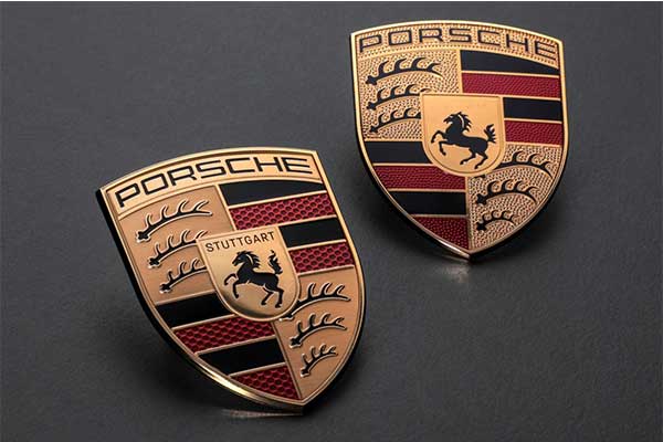
Earlier this year, Porsche presented a new logo, although we give it too much credit by talking about a ‘new logo’. After all, the basis is the same, the logo is only different from the previous one on a detailed level. After all, Porsche also understands that it would not be wise to put the recognizable shield aside and come up with a completely different logo. Porsche was that wise in the early 1960s when it came very close to introducing a completely new logo.
According to Porsche, nothing can be found about it in the official archive, but evidence of a possible logo change has been preserved through former secretary Ghislain Kaes. In 1961 there was correspondence about changing the logo because the shield was ‘not modern and recognizable enough’. The logo dating from 1952, consisting of the coat of arms of the state and that of Stuttgart, could perhaps better make way for a simpler and more modern logo with the ‘P’ of Porsche in it.
Hanns Lohrer, who also designed advertisements for Porsche, was commissioned by advertising chief Hermann Lapper to design alternative logos. Lohrer came up with the above suggestions. All fairly modern logos for their time with a somewhat simpler character than the existing logo. Lohrer was inspired by the logos of Mercedes-Benz and Volkswagen. The exact reaction to these proposals is not known, but according to Porsche, Ferry Porsche in particular would not have been a fan of changing the logo. He probably put a stop to it at the time, if these logos made it to his desk at all.