


News
BMW Introduces Redesigned Logo, Check It Out (Photos)


![]()
The Bavarian Motor Works (BMW) recently rejigged its logo to a more transparent variant essentially for brand communication. This logo update is the sixth version since its first introduction in 1917.
While the rejig is more than just a design update; the layout of BMW’s new brand look and feel stands for the mobility of the future and epitomises BMW’s direction of becoming a more relationship brand.
According to Jens Thiemer, Senior Vice President Customer & Brand BMW, the new communication logo radiates openness and clarity. “With this new transparent variant, we want to invite our customers more than ever to become part of the BMW world. In addition, our new brand design is geared to the challenges and opportunities of Digitization for brands. With visual restraint and graphic we are equipping ourselves flexibly for the wide variety of contact points in communication at which BMW will show its presence online and offline in the future. The additional communication logo symbolizes the significance and relevance of the brand for mobility and driving pleasure in the future.”
![]()

The Brand Manager of BMW, Coscharis Motors, Aregbeshola Cletus states that BMW’s logo has been a hot discussion topic for decades. And all because of a publicity stunt in which a BMW ad from 1929 showed an airplane with the BMW Logo in the rotating propeller. This has made many people to believe that the BMW logo depicts a stylized propeller.
Fred Jakobs, Archive Director, BMW Group Classic explains that the truth is a little different. The first key to the meaning of the BMW logo are its colors: white and blue are the colors of the State of Bavaria in Germany, home of BMW. But they are in the inverse order (at least as far as heraldic rules are concerned, where you read clockwise from the top left). The reason for this inverse order of blue and white in the BMW logo was the local trademark law at the time, which forbade the use of state coats of arms or other symbols of sovereignty on commercial logos.
This is how the BMW logo changed over the years between 1917 and 2020.


-

 News1 week ago
Liberian Senator’s Toyota Land Cruiser SUV Nearly Fell Into River After Its Tyres Slipped Off A Narrow Bridge
-

 News1 week ago
Volkswagen ID.4 Owners File A Lawsuit Regarding Charging Limits And Battery Recall
-

 News7 days ago
Ford Recalls Several Vehicles Over Defective Ecoboost That Can Cut Power
-

 News1 week ago
BYD Executive Vice President Says Brands Like Maserati Are “Very Interesting”
-

 News6 days ago
No Casualties Reported As Mercedes-Benz G-Class Collides With A Barrier At Eko Hotel Roundabout
-

 Latest Cars1 week ago
FIAT Reveals First Image Of Its Grizzly SUV, Grizzly Fastback Ahead Of Start Of Sales In Second Half Of 2026
-

 Latest Cars1 week ago
Official: BMW M2 xDrive Variant Released
-
 Auto Sport4 days ago
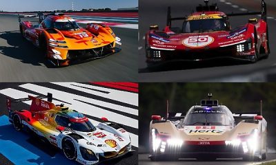
Le Mans Hypercar Class : Here Are The Race Cars Being Fielded By Top Manufacturers Like Ferrari, Cadillac And Toyota

