Auto Fun
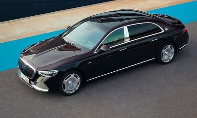
Audi, Benz And BMW Logos And Their Meaning
-

 News2 days ago
Official Cars Used By Muhammadu Buhari During His Rule As Nigerian President, Military Head Of State
-

 News6 days ago
Throwback : Michael Ibru Poses With His Bugatti-style ‘Panther De Ville’ – Britain’s Most Expensive Car At The Time
-

 News7 days ago
‘So What?’ FCT Minister Wike Defends Use Of Rolls-Royce Ghost, Said He Used Mercedes-Benz As A Student
-

 News1 week ago
Geely-owned Lotus To Keep Making Sports Cars In The UK, Debunks Reports Of Plant Closure
-

 News1 week ago
NNPC Ltd Presents 35 CNG Buses To The Presidential Compressed Natural Gas Initiative (PCNGi)
-

 News4 days ago
NASENI CEO Meets With Chairman Of Chery In China To Explore Partnerships On EVs, Local Assembly
-

 News1 week ago
Video Of VP Shettima Opening Car Door For His Brazilian Counterpart Sparks Online Debate
-

 News6 days ago
All-new 2026 Range Rover Sport SV Black Appear As If ‘Dipped In Black’


