

News
Audi Launches New 2D Black And White Logo Design For Its Four Rings Which Is Flatter


Audi has redesigned its highly recognizable four-ring logo, giving it a new 2-dimensional appearance, in addition, the new-look emblem also trades the old chrome-colored rings for new black and white ones which have been integrated into the Q8 E-tron SUV.
Audi’s new, flatter logo lacks any chrome, instead opting for a high-contrast black-and-white look that adds 3D-like details. The company will still allow customers to get the new rings in black, with the revamped variation replacing the bright white with a dark gray. Audi’s new logo coincides with the automaker also standardizing the fonts used inside and out. It’s called “Audi Type,” which customers will begin seeing on the B-pillar of new Audi models and likely elsewhere throughout the vehicle.
Designer Andre Georgi and brand strategist Frederik Kalisch shared why it was time to adopt a new look. Georgi explains that Audi has always taken a purist approach when it comes to design. He explains that the four rings are an unmissable feature of Audi products, and the new, white-over-black, two-dimensional look gives the vehicles a contemporary look that the old, chrome, 3D logo could not provide.
As strategist Frederik Kalisch explained, the “two-dimensional rings originated at Audi in 2016 as a consequence of digitalization, essentially to depict the rings in a manner that suited the medium.” However, the company wanted to have a “consistent brand presence across all customer touchpoints,” so they embarked on the process of redesigning the rings for their vehicles.
The German luxury brand isn’t the only automaker to introduce a new badge in recent months. French manufacturer Citroen has also previewed a new Chevron logo, which harks back to the original design created by Andre Citroen in 1919.
![]()
![]()
![]()
![]()


-

 News1 week ago
Official Car Of Inspector-General of Police, IGP Egbetokun – Toyota Land Cruiser 300 Series II SUV
-

 Celebrities Auto1 week ago
Odumodublvck Calls Out Headies Over Unfulfilled Car Prize Gift, 3 Months After Emerging ‘Next Rated’ Winner
-

 News1 week ago
While Putin’s Bodyguards Carries ‘Poop Suitcase’, North Korean President Uses Mercedes With Toilet During Foreign Trips
-

 News1 week ago
A “Hardcore” Bentley Continental GT Without A Hybrid Could Be Made
-
 Concept Cars4 days ago
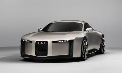
Audi Unveils Concept C, An Electric 2-door Sports Car That Previews Upcoming Future Production Model
-

 Car Facts4 days ago
Does A Car’s Start-Stop Mechanism Save Fuel Or Add To The Load On Drivers?
-
 News1 week ago
Audi Is Thinking About Setting A New Sales Goal Of 2 Million Cars Annually
-

 Latest Cars3 days ago
All-new Electric Mercedes-Benz GLC Arrives With A New Grille, 713-km Of Range