News
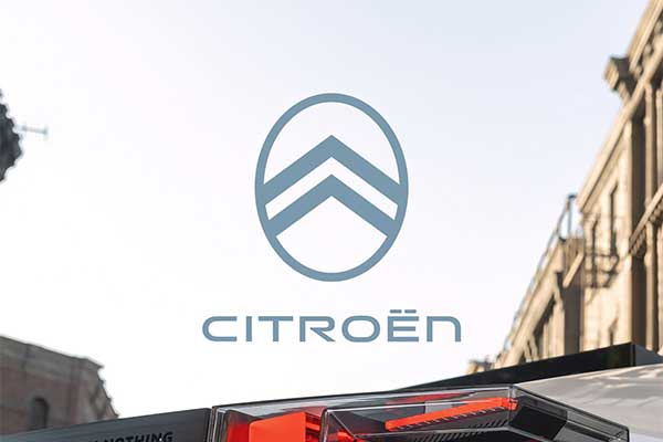
French Automaker Citroen Unveils New Logo And Its A Blast From The Past
After VW, Skoda, Volvo, Dacia, and Peugeot changed their logos in recent years, Citroën is the next European automaker to tweak its corporate identity. The fresh take on the double chevron is a throwback to the original design from 1919 adopted by André Citroën and represents the tenth evolution in 103 years. We’ll see it for the first time on a car soon on what the company refers to as a “significant conceptual family vehicle.”
The new logo is combined with a fresh and simplified colour palette plus a modern font for the Citroen lettering. In one of the different variations, the logo is painted in “Monte Carlo Blue”, which will also make a comeback as an exterior shade for future Citroen models. However, Citroen also uses the more flashy “Infra-Red” for physical, print, and digital applications, replacing the brand’s signature red.
With the new badge, Citroën is also embracing a new brand identity, which includes a new brand signature: “Nothing Moves Us Like Citroën.” The latter will start to be used in both corporate and product communications in the future, so expect to read that in an e-mail signature when you are expecting a message from your local Citroën dealership.
Speaking on the new brand identity, Citroen CEO Vincent Cobee said: “As we embark on probably the most exciting chapter in our illustrious 103-year history, the time is right for Citroën to adopt a modern and contemporary new look. Our new identity is an elegant symbol of progress as we move our customers physically in daring, forward-looking vehicles that challenge traditional industry rules, and emotionally by ensuring their entire experience – particularly going electric – is more affordable, comfortable and enjoyable whatever their wants and needs.
-
Also See: Nigeria’s Vice President’s Daugther, Kiki Osibanjo Cruises In A 1955 Citroen DS (See PHOTOS)